


Built with trust.


Trust Projects had outgrown the brand they began with. After six years, the business had matured into a nationally recognised commercial builder delivering refined hospitality, retail and workplace interiors for some of Australia’s most design-led brands. Our role was to evolve the identity into something sharper, more confident and more aligned with the calibre of spaces they help bring to life.




From commercial builder to creative project partner.
Trust Projects sits at the intersection of construction, design and client service. The refreshed identity needed to hold the credibility of a serious builder, while carrying the polish, taste and creative confidence expected by architects, hospitality groups and retail brands. It was less about decoration, and more about building a system with structure, weight and intent.
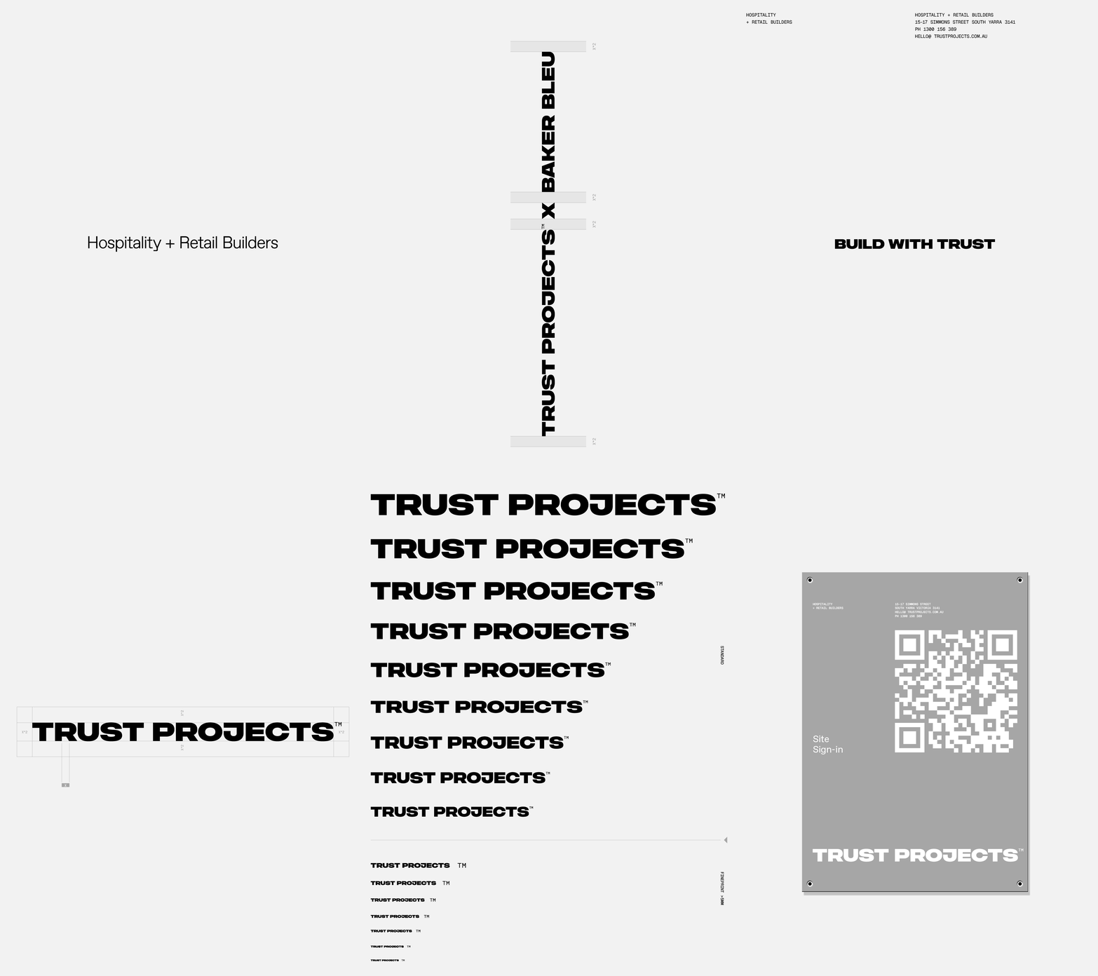
The wordmark was redrawn as a bold, highly legible mark with an industrial presence and a strong sense of momentum. Its compact geometry gives the brand a confident foundation across every touchpoint, from business cards and fee proposals to site signage, vehicle livery and apparel. Around it, a restrained palette of black, white, grey and silver allows the work to remain front and centre.
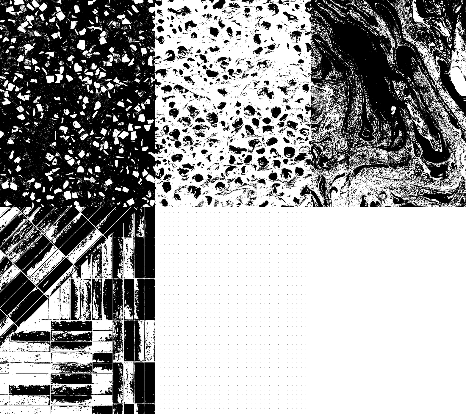
A key part of the identity is the use of graphic textures drawn from the interiors themselves. Terrazzo, timber, stone, tile and surface details are abstracted into high-contrast black and white forms. These textures become more than a visual device. They act as project-specific signatures, giving each case study its own material language while keeping everything unmistakably Trust Projects.
The result is a brand system that feels tactile, confident and built for real-world use. From the capability brochure and stationery suite to digital, signage, workwear and merch, the identity gives Trust Projects a more distinctive presence. One that reflects their craft, their clarity and their role as a trusted partner in creating design-led spaces.

